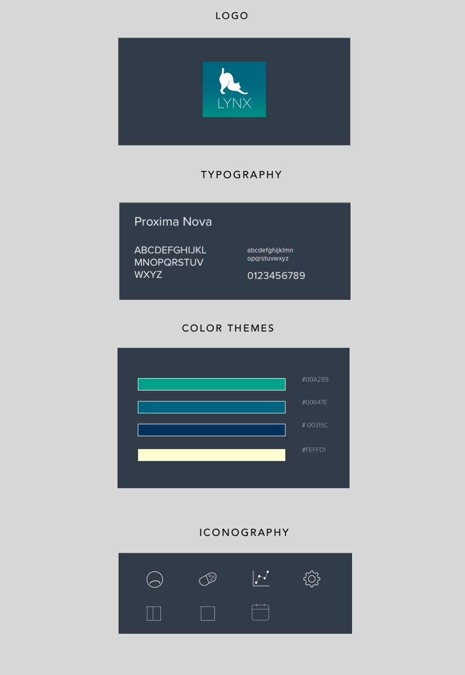
Lynx
UXUI Project
"Learn moore about your back pain."
The innovative Lynx app comes with features that allow patients to track their muscle pain intuitively. It monitors body data and provides clear feedback which encourages experimenting with treatments to see which are the most helpful. The device helps build healthy habits that improve the incidence of back pain. View the full case study here
Problem
Today, more than 50% of the working population suffers with back pain. Although there are many methods of treatment, the current market still lacks an efficient way to help patients:
.Track the pain intuitively
.Encourage experimenting with treatment habits
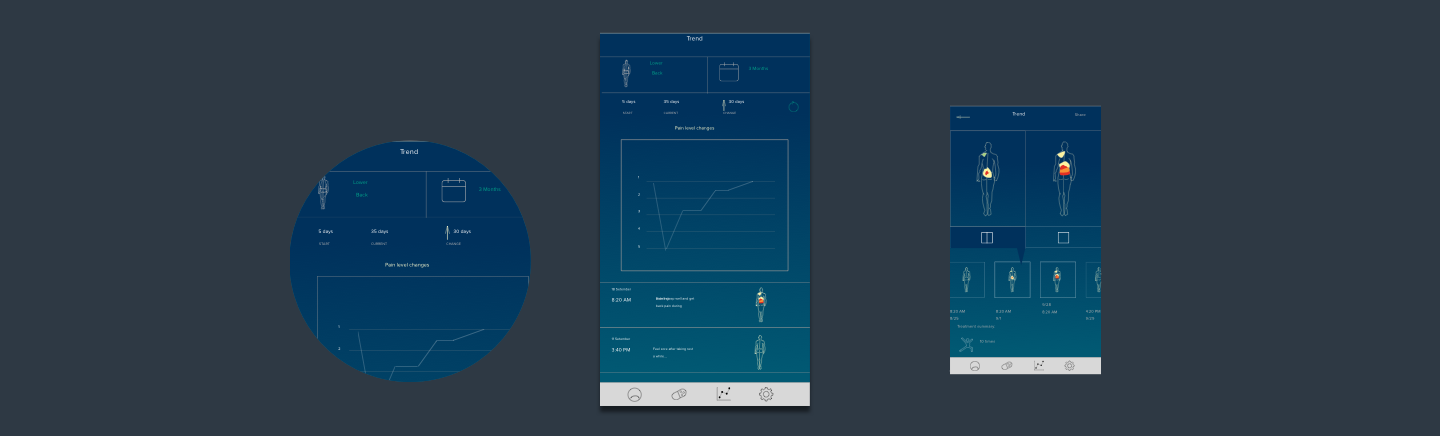
.Show useful trends of their pain
Solution
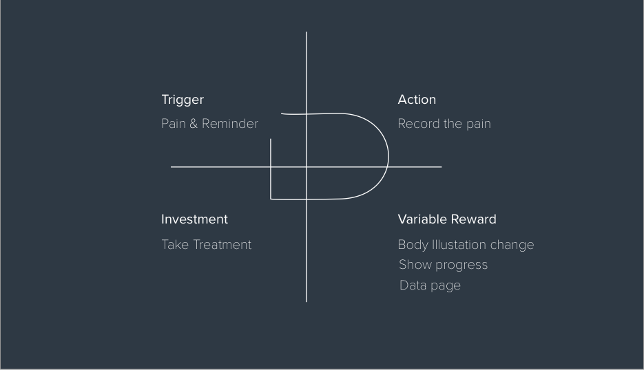
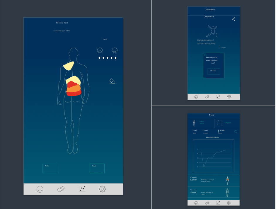
The app allows users to draw their pain on an illustration of the human body as a more intuitively way of recording pain. It provides treatment opinions, reminders and the status of progress to keep users engaged. It also shows links to treatments and improvements to build up the habit loop.
01. Theory
02. Key Features
Design Process
03. Approach
This two-month project covered analysis, design, evaluation and refinement.
3.1 Analysis:
I performed extensive research on back pain and the current solutions and studied the information in a book called "Hook: how to build a habit-driven product” by Psychology professional Nir Eyal. Then I applied the theory to my design and developed the concept prototype.
3.2 Design:
Based on the above research, I started to build persons to lead my design direction. In addition to confirming userflow, I also used it as a clue to develop my visual elements
3.3 Evaluation:
I evaluated my design by asking selected interviewees to perform exclusive tasks to evaluate the success rate.
3.4 Refinement:
I conducted several user tests to literate my design.
04. Target Market
| AGE | THCH LEVEL | KEY FEATURES |
|---|---|---|
| 25 - 55 | Medium | People who feel back pain |
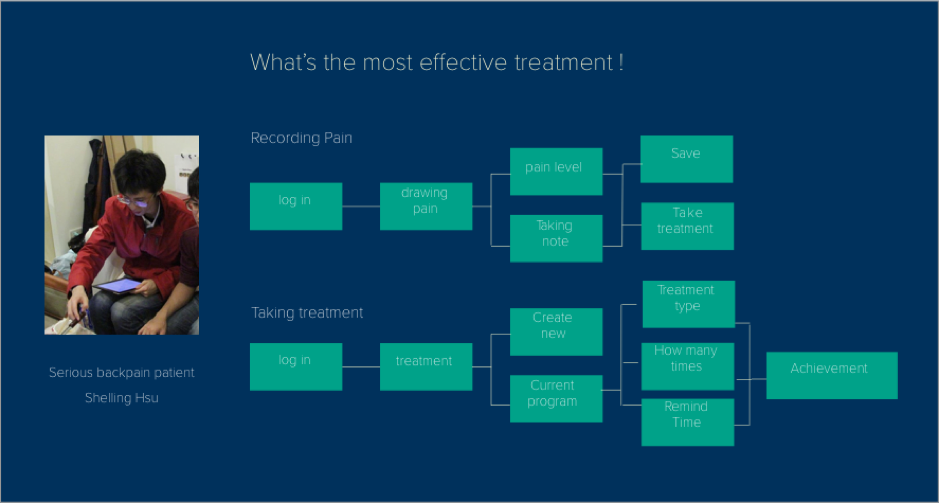
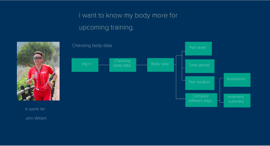
05. Persona:
06. UX Solutions:
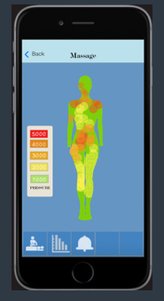
6.1 Patient needs more than a record
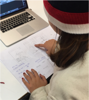
To begin the project, I started with research about the seriousness of this issue. After studying a few competitors’ products, I came up with the idea that drawing pain using an illustration of the human body. I made a paper prototype and conducted five interviews with selected users. Although they all had positive responses to the idea of recording pain by drawing it, most of them indicated they needed more aggressive improvements before the product would be useful. The testing feedback started the process of improving the app.
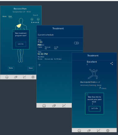
6.2 Encourage users to make progress
The first version of the app only created a record page. The later edition of the app encourages users to take treatment at once after the record. Feedback data shows the progress of treatment cycle to let users feel whether they are improving.